In the ever-evolving digital landscape, responsive web design is no longer just a “nice-to-have” — it’s a necessity. With mobile-first indexing and a growing variety of screen sizes (from foldables to ultrawide monitors), building fluid, adaptive interfaces is critical in 2025.
In this blog, we’ll cover the core principles, common pitfalls, and updated best practices to ensure your website or web app delivers a seamless experience across all devices.
What Is Responsive Web Design?
Responsive web design (RWD) is an approach that allows websites to adjust gracefully to different screen sizes and orientations using flexible layouts, media queries, and modern CSS techniques.
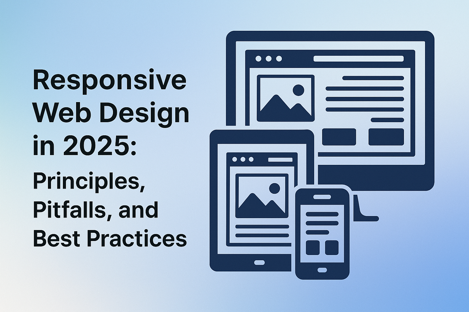
A responsive site eliminates the need for multiple versions (e.g., m.site.com) and instead adapts fluidly, ensuring consistent usability and performance on smartphones, tablets, laptops, and desktops.
Core Principles of Responsive Design (2025 Edition)
Fluid Layouts
- Use percentage-based widths instead of fixed pixel values.
- Embrace
flexandgridlayouts for responsive structures.
Media Queries
- Target device widths using
@mediarules. - Adjust layout, font size, and element visibility at key breakpoints.
Mobile-First Approach
- Design for small screens first, then progressively enhance.
- Prioritizes performance and core functionality.
Responsive Images
- Use
srcsetandsizesfor image optimization. -
Prefer
WebPorAVIFfor faster loading times.
Accessibility & Readability
- Ensure readable font sizes (
min 16pxon mobile). - Use relative units (
em,rem,%) for better scaling.
Common Pitfalls to Avoid
- Overusing Breakpoints: Too many breakpoints lead to bloated CSS and maintenance overhead. Stick to meaningful layout shifts.
- Ignoring Touch Interactions: Click targets should be large enough for fingers. Avoid hover-only functionality on mobile.
- Hardcoded Heights: Fixed heights break layouts on small screens. Prefer
min-heightor content-driven sizing. - Neglecting Performance: A beautiful UI is useless if it loads slowly. Optimize CSS, JavaScript, and image delivery.
- Testing Only on Desktop: Always test on real devices (or emulators) to catch layout bugs early.
Best Practices for 2025 and Beyond
- Use CSS Clamp() for Dynamic Sizing.
font-size: clamp(1rem, 2.5vw, 1.5rem);
Makes typography fluid across screen sizes without media queries. - Container Queries (New!)
Enables styling based on parent container size, not just viewport.
Ideal for component-level responsiveness.
@container (min-width: 500px) {
.card { flex-direction: row; }
} - Utilize Modern CSS Features
:has()pseudo-class for parent-aware styling.
Logical properties likemargin-inline,padding-block. - Embrace Utility-First CSS Frameworks
Frameworks like Tailwind CSS speed up responsive UI development with consistency. - Audit with DevTools and Lighthouse
Run regular audits for mobile usability, performance, and accessibility
Final Thoughts
Responsive design is more than technical implementation — it’s a user-first mindset. In 2025, the web must serve diverse devices, bandwidths, and user abilities.
Whether you’re building a marketing site or a complex web application, following modern responsive design principles ensures better engagement, improved SEO, and a stronger brand image.